Introduction
Welcome to PythonSage! In this post,
we'll explore how to create engaging, interactive data visualizations using
Python and Plotly. Plotly is a powerful and easy-to-use library that allows you
to create interactive charts and graphs, making your data come to life. Whether
you're a data analyst, scientist, or enthusiast, Plotly can help you present
your data in a more informative and visually appealing way.
Introduction to Plotly in Python
Plotly is an open-source graphing library
that makes interactive, publication-quality graphs online. It offers a wide
variety of chart types, including line plots, scatter plots, bar charts, and
more. With Plotly, you can create complex visualizations with simple and
concise code.
Installing Plotly
First, let's install Plotly. You can install it using pip:
pip install plotly
Creating Your First Plotly Chart with Python
Let's start with a simple line chart. We'll use some sample data to demonstrate how easy it is to create an interactive chart with Plotly.
import plotly.graph_objs as go

import plotly.express as px

import pandas as pd


# Sample data

data = {

    'Year': [2015, 2016, 2017, 2018, 2019, 2020],

    'Sales': [450, 560, 670, 780, 890, 920]

}


df = pd.DataFrame(data)


# Create a line chart

fig = px.line(df, x='Year', y='Sales', title='Yearly Sales Data')


# Show the plot

fig.show()
Line Chart Picture
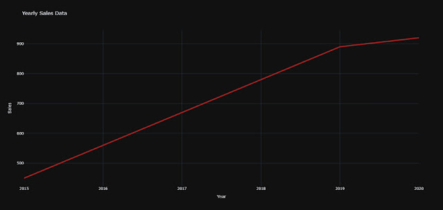
This code will generate an interactive line chart showing the yearly sales data. You can hover over the points to see the exact values, zoom in and out, and even export the chart.
Customizing Your Charts
Plotly allows you to customize your charts extensively. You can change colors, add titles, and modify axes. Let's enhance our line chart with some customization.
import plotly.graph_objs as go

import plotly.express as px

import pandas as pd


# Sample data

data = {

    'Year': [2015, 2016, 2017, 2018, 2019, 2020],

    'Sales': [450, 560, 670, 780, 890, 920]

}


df = pd.DataFrame(data)


# Create a line chart

fig = px.line(df, x='Year', y='Sales', title='Yearly Sales Data')

# Customize the line chart

fig.update_traces(line=dict(color='firebrick', width=4))

fig.update_layout(title='Yearly Sales Data',

                  xaxis_title='Year',

                  yaxis_title='Sales',

                  template='plotly_dark')

# Show the plot

fig.show()
Customize line chart Picture
Creating Different Types of Charts
Plotly supports a variety of chart types.
Let's create a bar chart and a scatter plot to see some of the possibilities.
Bar Chart
import plotly.express as px

import pandas as pd

# Sample data

data = {

    'Category': ['A', 'B', 'C', 'D'],

    'Values': [10, 15, 7, 12]

}


df = pd.DataFrame(data)


# Create a bar chart

fig = px.bar(df, x='Category', y='Values', title='Bar Chart Example')


# Show the plot

fig.show()
Bar Chart Picture
Scatter Plot
import plotly.express as px

import pandas as pd


# Sample data

data = {

    'X': [1, 2, 3, 4, 5],

    'Y': [10, 11, 12, 13, 14]

}


df = pd.DataFrame(data)


# Create a scatter plot

fig = px.scatter(df, x='X', y='Y', title='Scatter Plot Example')


# Show the plot

fig.show()
Scatter Plot Picture
Adding Interactivity
One of the strengths of Plotly is its interactivity. You can add dropdowns, sliders, and other interactive elements to your charts. Here's an example with a dropdown to switch between different types of plots.
# Import necessary libraries

import plotly.graph_objs as go

import plotly.express as px

from plotly.subplots import make_subplots

import pandas as pd


# Sample data for line chart

data_line = {

    'Year': [2015, 2016, 2017, 2018, 2019, 2020],

    'Sales': [450, 560, 670, 780, 890, 920]

}


df_line = pd.DataFrame(data_line)


# Create a line chart

fig_line = px.line(df_line, x='Year', y='Sales', title='Yearly Sales Data')


# Customize the line chart

fig_line.update_traces(line=dict(color='firebrick', width=4))

fig_line.update_layout(title='Yearly Sales Data',

                       xaxis_title='Year',

                       yaxis_title='Sales',

                       template='plotly_dark')


# Show the line chart

fig_line.show()


# Sample data for bar chart

data_bar = {

    'Category': ['A', 'B', 'C', 'D'],

    'Values': [10, 15, 7, 12]

}


df_bar = pd.DataFrame(data_bar)


# Create a bar chart

fig_bar = px.bar(df_bar, x='Category', y='Values', title='Bar Chart Example')


# Show the bar chart

fig_bar.show()


# Sample data for scatter plot

data_scatter = {

    'X': [1, 2, 3, 4, 5],

    'Y': [10, 11, 12, 13, 14]

}


df_scatter = pd.DataFrame(data_scatter)


# Create a scatter plot

fig_scatter = px.scatter(df_scatter, x='X', y='Y', title='Scatter Plot Example')


# Show the scatter plot

fig_scatter.show()


# Sample data for subplots

data_subplots = {

    'X': [1, 2, 3, 4, 5],

    'Y': [10, 11, 12, 13, 14]

}


df_subplots = pd.DataFrame(data_subplots)


# Create subplots

fig_subplots = make_subplots(rows=1, cols=2, subplot_titles=('Line Chart', 'Bar Chart'))


# Line chart for subplots

fig_subplots.add_trace(go.Scatter(x=df_subplots['X'], y=df_subplots['Y'], mode='lines', name='Line Chart'), row=1, col=1)


# Bar chart for subplots

fig_subplots.add_trace(go.Bar(x=df_subplots['X'], y=df_subplots['Y'], name='Bar Chart'), row=1, col=2)


# Update layout for subplots

fig_subplots.update_layout(title_text='Interactive Charts with Plotly')


# Show subplots

fig_subplots.show()
Conclusion
Plotly makes it incredibly easy to create
interactive and visually appealing charts and graphs with Python. Whether
you're working with simple datasets or complex data structures, Plotly provides
the tools you need to bring your data to life. Start experimenting with Plotly
today and see how it can enhance your data visualizations!
Don't
forget to check out the following resources to learn more about Plotly and how
you can leverage it for your projects:
For more tips, tutorials, and Python
projects, stay tuned to PythonSage.
Happy coding!


.webp)

.webp)
.webp)
